In short
Plenty of business websites get traffic but almost no enquiries. Visitors arrive, scan for a few seconds, cannot see why they should trust or contact the business, and leave.
Design the site around one outcome: a visitor taking the next step. That means a clear promise, one primary call to action per page, a short low-friction form, visible proof, a fast mobile experience and ongoing testing based on real data.
A website that looks good and a website that generates leads are not automatically the same site. Plenty of beautiful business websites collect traffic and produce almost nothing, because nothing on the page is designed to make someone act.
Lead generation design is not a trick. It is a set of disciplined decisions that make it easy for the right visitor to trust you and take the next step.
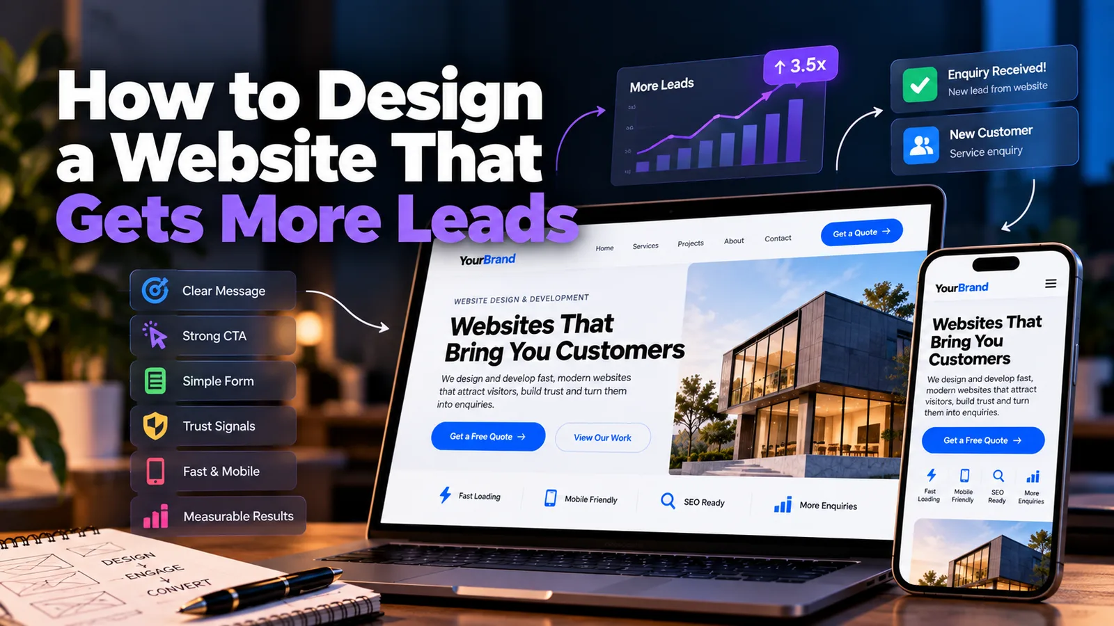
Start with one goal per page#
Before any layout, decide what a visitor should do on each page. One primary action: request a quote, book a call, start a trial, call now. Everything else on that page either supports that action or gets removed.
A page that tries to do five things usually achieves none of them. If you cannot state the goal of a page in one sentence, the page is not ready to design.
1. Lead with a clear promise#
Your headline has about five seconds. It should say what you do, who it is for and the outcome they get.
| Weak | Stronger |
|---|---|
| "Welcome to Sharma & Co." | "Accounting and GST filing for small businesses in Pune" |
| "Innovative solutions for modern needs" | "Get a professional website live in 14 days" |
| "We are passionate about quality" | "Free home-delivery dental check-ups in Indore" |
Under it, add one line that removes the most common doubt: timeline, price approach, guarantee or experience. Then the call to action, before the visitor scrolls.
2. Make the call to action impossible to miss#
A call to action (CTA) is the button or link that asks for the lead. Good ones share a few traits:
- Specific wording that says what happens: "Get a free quote" beats "Submit"
- High contrast so it stands out from everything else on the page
- Repeated at natural decision points - top, middle and bottom of long pages
- One primary CTA per page, with any secondary action visually quieter
- Thumb-friendly on mobile, often with a sticky call or WhatsApp button
If you ask people to squint for the button, you are choosing not to have leads.
3. Keep forms short and low-friction#
The form is where most leads are lost. Every additional field is another reason to give up.
- Ask for the minimum: name, phone or email, and a short message
- Say what happens next: "We reply within one working day"
- Show reassurance near the button: "No spam. Your details stay private."
- Offer alternatives - click-to-call, WhatsApp - for people who hate forms
- Test the form on a phone, with the keyboard open
4. Show proof, not just promises#
Anyone can write "we are the best". Visitors believe evidence.
- Testimonials with names, photos and specific results
- Case studies that describe the problem, what you did and what changed
- Numbers: years in business, projects delivered, customers served (only if true)
- Client logos, certifications, awards, media mentions
- Reviews from Google, placed near the CTA where doubt is highest
Place proof next to the moment of decision, not buried on a separate page nobody visits.
5. Design for mobile first#
Most of your visitors are on phones, so design the phone experience first and expand it for desktop, not the reverse.
- Readable body text without pinching to zoom
- Large tap targets with space between them
- Short paragraphs and clear subheadings
- Forms with the right keyboard type (numeric for phone, email for email)
- A click-to-call button that actually dials
6. Be fast#
Every extra second of load time loses visitors, particularly on mobile data. Compress images, use modern formats like WebP, avoid stacking heavy plugins and scripts, and choose decent hosting. A fast site feels trustworthy before a single word is read.
7. Write for scanning#
People do not read websites; they scan them. Help them:
- Headings that tell the story on their own
- Short paragraphs, generous whitespace
- Bullet points for benefits and features
- Benefits before features: what it does for them, then how
- Plain language - drop the jargon
If a visitor can skim only your headings and still understand your offer, the page works.
8. Reduce anxiety and objections#
People hesitate for predictable reasons: price, time, risk, "will this work for me?". Answer them on the page.
- A short FAQ addressing real pre-sales questions
- Clear process: "1. Tell us what you need. 2. Get a quote. 3. We deliver."
- Pricing transparency, even if it is only a starting range
- Guarantees or trial offers where you can genuinely offer them
An FAQ also helps search visibility, since it mirrors the questions people type into Google.
9. Match the page to the traffic source#
Someone clicking an ad for "emergency plumber in Nagpur" should land on a page about exactly that, not your generic homepage. Matching the message to what the visitor just clicked - called message match - is one of the simplest ways to improve conversions, particularly for paid campaigns.
- Ads go to a focused landing page with one offer and one CTA
- Search visitors land on the specific service page, not the homepage
- Social referrals usually need more trust-building before asking for action
10. Measure, then improve#
A lead-generating site is never finished. Set up tracking so you know what is happening:
- Conversion tracking for form submissions, calls and WhatsApp clicks
- Google Analytics to see which pages and sources bring leads
- Heatmaps or session recordings to watch where visitors get stuck
- One change at a time, so you know what worked
Small tests add up: a clearer headline, a shorter form, a moved testimonial, a rewritten button.
A quick lead-gen checklist#
| Check | Done? |
|---|---|
| Headline states what I do, for whom, and the outcome | |
| One primary CTA per page, high contrast | |
| Form has only essential fields | |
| Testimonials or proof near the CTA | |
| Site works and loads fast on a phone | |
| Click-to-call and WhatsApp available | |
| FAQ answers real objections | |
| Landing pages match ad or search intent | |
| Conversion tracking is live | |
| I have tested the form myself this month |
The mindset that changes results#
Designing for leads means treating every page as a conversation with a slightly sceptical stranger. What do they need to know, what might worry them, and what is the smallest next step you can ask of them?
Get that right, and the same traffic you already have starts producing more enquiries without spending a rupee more on advertising.
If you would like a site built around exactly this thinking, or a candid review of why your current one is not converting, share a short brief through the project form on this site.
- lead-generation
- conversion
- web-design
- cta
- ux
Common questions
How do I get more leads from my website?
Make it clear what you offer, show proof that you deliver, give visitors one obvious next step, and remove friction from your enquiry form. Then measure what happens and improve it. Traffic only turns into leads when the page itself is built to convert.
What is a good website conversion rate?
It varies widely by industry and traffic source. Many service business sites see a few percent of visitors enquire, and well-optimised landing pages can do better. Treat any benchmark as a rough guide and focus on improving your own baseline over time.
How many fields should a lead form have?
As few as you can get away with. Name, a way to reach them and a short message is enough for most service businesses. Every extra field reduces completions, so only ask for what you truly need to follow up.
Where should the call to action button go?
Above the fold on the homepage and key landing pages, repeated after each major section, and again at the bottom of the page. On mobile, a persistent call or enquire button within thumb reach often helps.
Do I need a landing page or is my homepage enough?
For paid ads, a dedicated landing page usually converts better because it has one message and one action matched to the ad. For general organic visitors, a strong homepage plus focused service pages is usually enough.
Share this
Instagram has no web share link, so this gives you both pieces: copy the caption, save the card, then post it.
Got this problem too?
Websites, web apps and SaaS products in React and Next.js, with the backend, payments and integrations they need to actually run a business.