In short
A construction and civil engineering company has a serious, technical brand. That makes it hard to feel approachable on social media, where people follow faces and characters, not logos.
Give the brand a personality. A beaver, Canada's national animal and a natural builder, dressed in denim and a hard hat, with Concept Dash patches and sunglasses for attitude, drawn in many poses so it can carry any post.
When I joined Concept Dash, the brand had a clear job and a very serious look. The company works in civil engineering and construction contract administration. That is important work, but it is not the kind of thing people naturally want to follow on Instagram.
What the brand needed was a personality. Not a new logo, a character: something people could recognise, remember and maybe even like.
That is how the Concept Dash beaver started.
Why a beaver#
I started with research instead of drawing. The question was simple: which animal says something true about this company?
The beaver kept coming up, for three reasons:
- It is Canada's national animal. Concept Dash is a Canadian company, so the mascot belongs to where we are from.
- It builds. Beavers are known for constructing dams and lodges. A builder for a company that works in construction.
- It is friendly. A beaver is easy to like, which solves the "serious brand" problem.
Dressing it for the job#
Once the animal was settled, the next question was what it should wear. A mascot for a construction business should look like it belongs on a site.
- Denim work outfit. Practical, rugged and associated with the trade.
- A hard hat. The clearest signal of construction there is.
- Sunglasses. This was my addition, to make it cool. They give the beaver confidence and take away the stiffness.
- Concept Dash patches on the hat and the front of the outfit, so the brand is part of the character and not a sticker added afterwards.
Each detail does a job. Take any of them away and the character says less.
The hand-drawn stage#
I did not open design software first. I drew the beaver by hand, many times, changing the shape of the face, the proportions and the clothing.
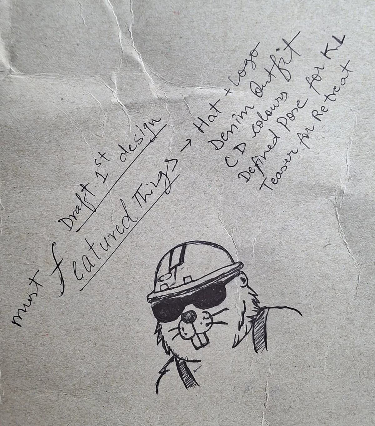
This is the first draft. Next to the sketch I wrote a short list of must-have features, so every later version had something to be checked against:
- Hat and logo: the hard hat, with the Concept Dash logo on it
- Denim outfit: the work clothes that say construction
- Concept Dash colours: purple and blue, so the character looks like part of the brand
- A defined pose: one clear, readable pose to start from
- A teaser for the retreat: the character had a first job already, announcing our retreat
Paper is fast and cheap. You can try ten faces in the time it takes to build one on a screen, and a weak idea becomes obvious very quickly. Only after the sketch felt right did I move it into a clean, final version.
One character, many poses#
A mascot that only exists in one pose is a sticker. A mascot with a set of poses is a character.
I drew the beaver in different poses so it could do different jobs: celebrating, pointing at something, explaining an idea, reacting to news. That meant it could appear in announcements, tips and everyday posts without looking repeated.
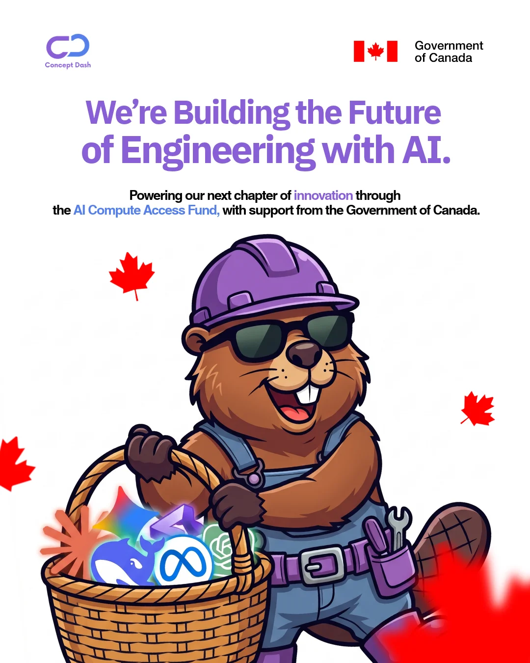
This is one of my favourite uses of it: a company announcement about our next chapter with AI, supported through the AI Compute Access Fund and the Government of Canada. The beaver is carrying a basket of AI tools, still in the hard hat and denim, still with the sunglasses. A serious announcement, but with a face on it, and with the maple leaves tying it back to Canada.
It also means other work builds on it. The beaver has since appeared in storyboards and in other illustrations across my work.
Launching it on Instagram#
A mascot only matters once people see it. We launched the beaver on the Concept Dash Instagram, introducing it as the brand's new character.
The main introduction post:
After the introduction, the beaver kept showing up in everyday posts. Here are a few of them:
It worked well. The character gave the page something recognisable, and it made a construction brand feel more human.
What I learned#
- Research first. The idea (Canada, builder, friendly) came before a single line was drawn.
- Every detail should mean something. Denim, hard hat, patches and sunglasses each carry part of the brand.
- Sketch by hand. It is the quickest way to find out what does not work.
- Design a system, not a picture. Poses are what make a mascot usable week after week.
What comes next#
Drawing the beaver was only half of it. In the next post I explain how I turned the mascot into a video: the storyboard, the frame-by-frame generation and the edit behind our retreat teaser.
If your brand feels too serious or too anonymous and you want a character that gives it a face, share a short brief through the project form on this site and we can scope it together. You can also read about the branding and graphic design service or browse more case studies.
- branding
- graphic-design
Common questions
Why did you choose a beaver for the mascot?
The beaver is Canada's national animal, and Concept Dash is a Canadian company. Beavers are also famous builders, which fits a company that works in civil engineering and construction contract administration. One animal connected the country, the industry and the work.
Why denim and a hard hat?
The company works in construction, so the mascot dresses like the trade: a denim work outfit and a hard hat. It reads as 'construction' at a glance without needing a caption.
Why sunglasses?
Construction branding can feel stiff. Sunglasses give the character confidence and a little humour, so it feels friendly rather than corporate.
Why draw the mascot by hand first?
Sketching on paper is the fastest way to test shapes, expressions and proportions before committing to a final design. A weak idea shows up quickly in a pencil sketch.
Why draw so many poses?
One fixed picture of a mascot gets stale fast. A set of poses lets the same character celebrate, point, explain or react, so it can appear across posts, reels and announcements.
Share this
One click opens LinkedIn with a ready-written post: a hook, the short version of this guide and the link. The caption is also copied, so you can paste it if it does not appear.
Instagram has no web share link, so this gives you both pieces: copy the caption, save the card, then post it.
Keep reading
10 Logo and Branding Mistakes Small Businesses Make
Ten common logo and branding mistakes small businesses make, from too many fonts to inconsistent colours, and how to fix each one.
How I Made a Retreat Teaser Video With Our Beaver Mascot (Storyboard, Frames and Edit)
Part 2 of the Concept Dash mascot story: how I storyboarded a retreat teaser frame by frame, generated each shot with AI video tools, and cut it into a video that made the team and the client say wow.
Got this problem too?
Brand visuals, posters, thumbnails and campaign assets that read as one system.